Sweethaven Branding
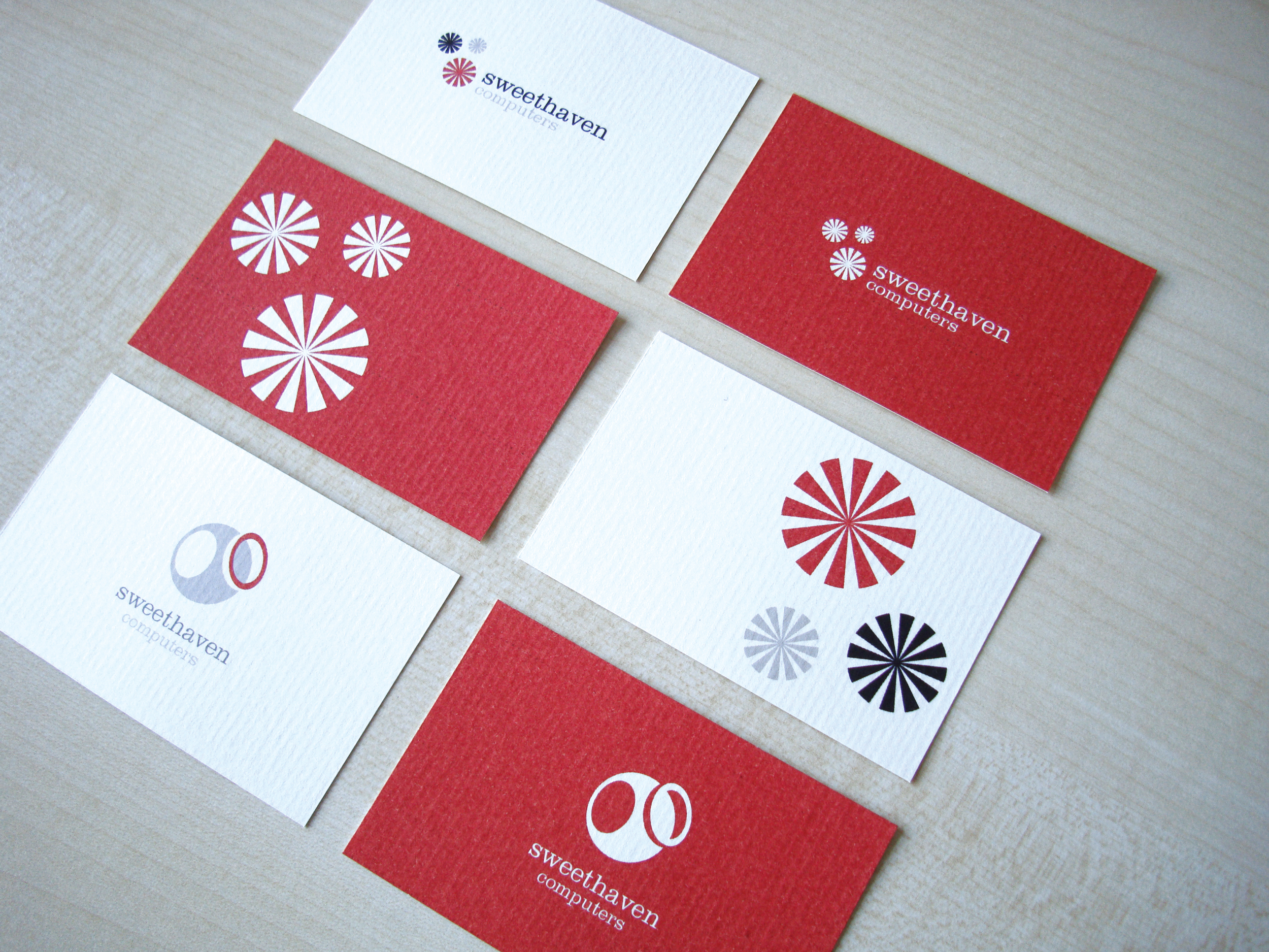
Working alongside marketing and PR company GG Communications this project involved the development of two logo concepts that drew upon the heritage of Sweethaven Computers. A long established local company, the shop in which Sweethaven is now based, was a well-known sweetshop in the area.
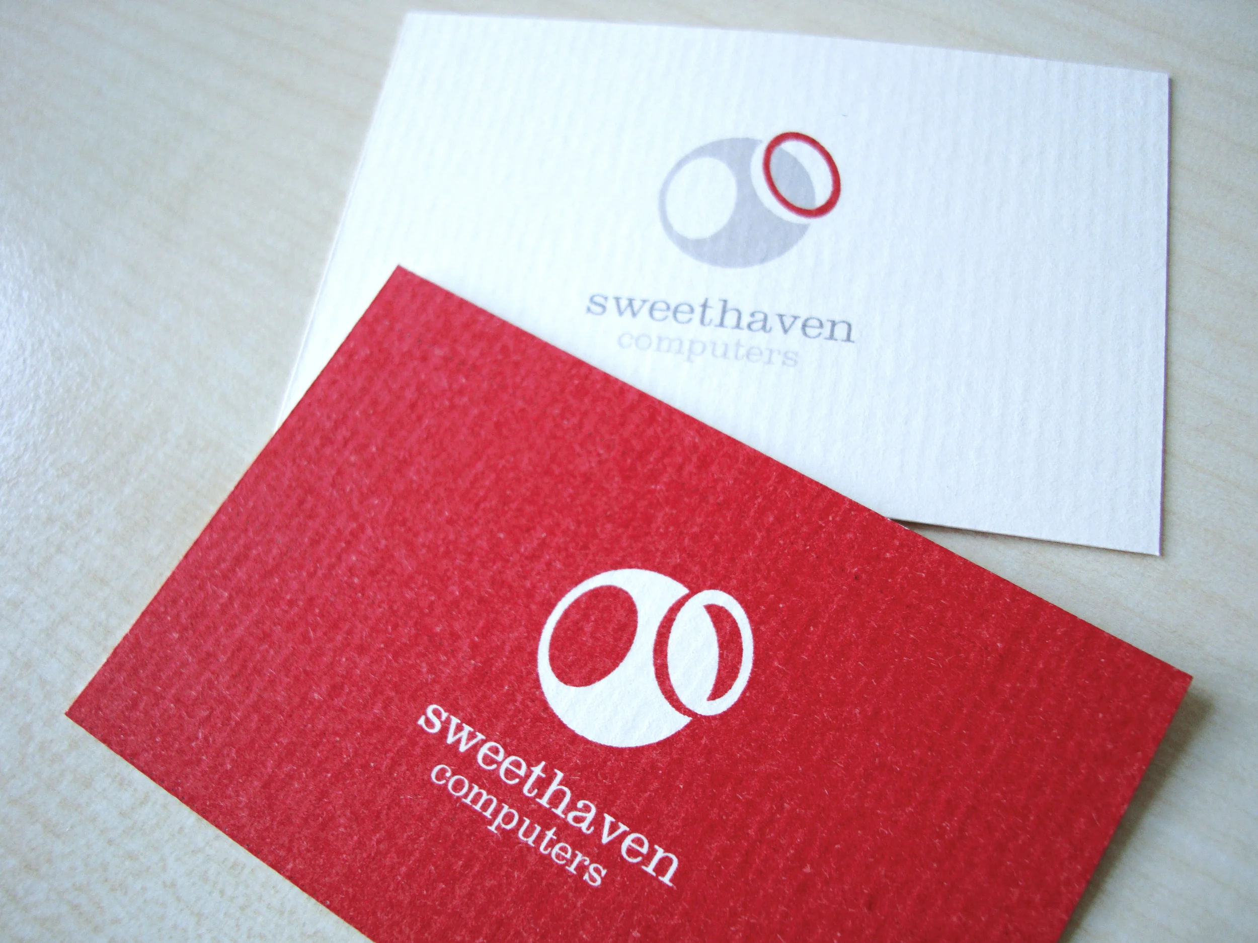
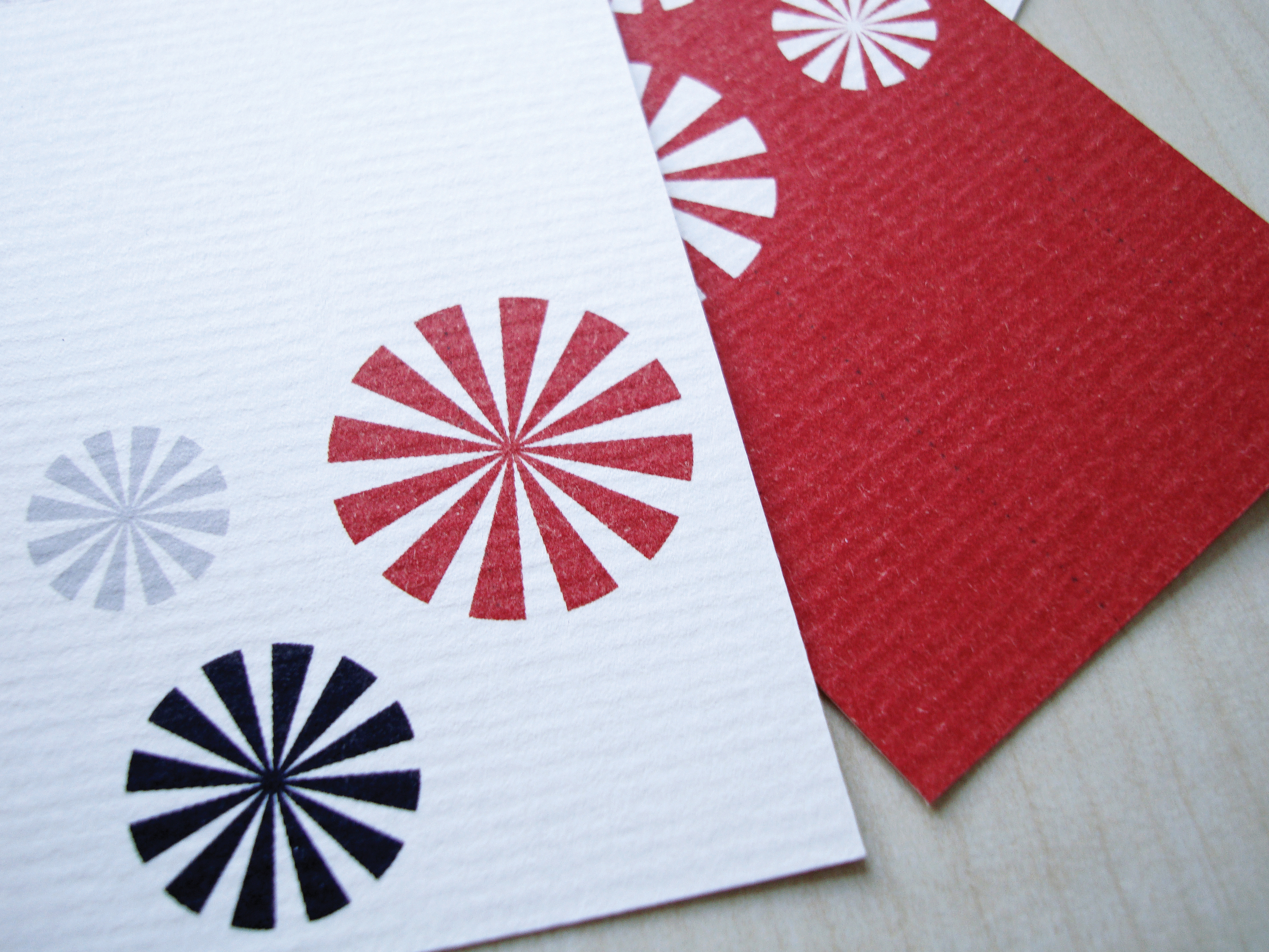
Retaining existing brand colours, one solution reflects abstract shapes and patterns associated with candy and boiled sweets, whilst the second idea simplistically depicts an old fashioned, round sweet jar as the basis for the logo mark.


