Evodia Brand Refresh
A brand refresh for independent, resourcing and technical consultancy Evodia.
Evodia already had an existing contemporary logo but wanted a refreshed visual language to bring their corporate identity up to date.
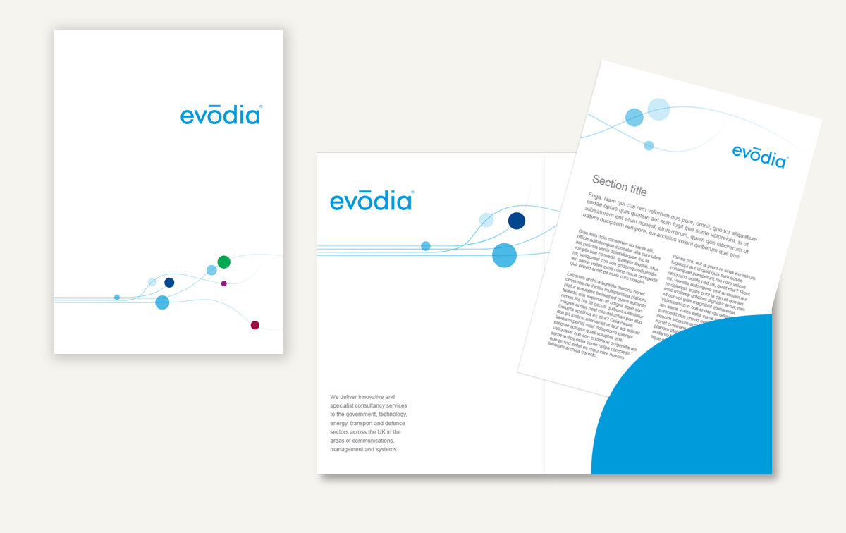
A graphic device was developed to subtly reflect a device and encompass some of the core company values: Knowledge / Integrity / Reliability / Trustworthy / Depth & honesty / Supportive & dependable / Responsible
The wavy lines were designed to represent the continual presence of (and commitment to) the values that run throughout the company, while the circles (elements) are used as an abstract device to indicate the different values flowing through the business, in a subtle yet engaging way.
Keeping the main cyan colour that the business already used, a set of complimentary colours were chosen to represent the various sectors of the business. These were to be used across different media platforms to help identify the different business areas and enhance overall brand recognition. The elements (circles), when implemented in the ‘sector colours’, help to identify or highlight the different areas of the business and reflect Evodia’s diverse knowledge and skill base.
The overall brand refresh included leaflets, adverts, exhibition stands, website refresh and a range of corporate literature.


